
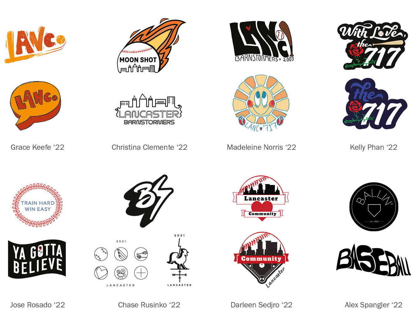
Grace Keefe ’22 hits a home run with new Lancaster Barnstormers merch
Tuesday, June 8th, 2021
Step inside the stadium gift shop of Lancaster’s minor league baseball team, and you can’t miss the ballcaps bearing a new design for the 2021 Lancaster Barnstormers.
It’s a contemporary swoosh of orange tones, a “LANC.” abbreviation that feels like it’s in motion, accented by a heart in the center of the “A” and held in place by a baseball in place of the period at the end. It’s the work of Grace Keefe, a rising Graphic Design senior at PCA&D.
And that’s for starters. Above the ballcap display is a poster displaying all the designs submitted by students in Prof. Pam Barby’s Design Studio II class as part of a competitive commission.
That, says Barnstormers partner Rob Liss, is because the team was wowed enough by every design to want to honor them in some way.
“All of my classmates had wonderful designs which I could see on a cap representing Lancaster,” Keefe says. “When I found out my design was picked (to be put on the new style of ballcaps), I was pretty shocked!”
How it all started
The Barnstormers had an idea:
Wouldn’t it be great to offer merchandise with a new logo — not necessarily one to replace the red and black script emblazoned on their uniforms, but one that felt contemporary while at the same time reflecting a young and vibrant view of “what Lancaster means to you.”
But who to design this new logo?
Liss and team Vice President Kristen Simon decided to turn to students of the art and design school located just a few blocks south of the Barnstomers’ home stadium on North Prince Street.
All eight of the artists involved in the Barnstormers project are rising seniors: Christina Clemente, Grace Keefe, Madeleine Norris, Kelly Phan, Jose Rosado, Chase Rusinko, Darlene Sedjro, and Alex Spangler.
“I’ve always dreamed of, how do we incorporate art into the stadium,” Liss says. “It’s always been in the back of my mind; there are lots of art teachers in the family. So the real guts of (the idea) is, trying to offer opportunities.”
So when pitching the idea to Prof. Barby’s class, the assignment was for the artists to come up with a design that reflects what Lancaster means to them, while still tying in the idea of the Barnstormers baseball team. It also, Keefe says, had to appeal to a college-age demographic and “needed to be something we would pick out ourselves.”
Her idea, she says, was to “go with a rough and edgy hand-lettered design. It encapsulated my first impressions of Lancaster while still holding the ability to reflect the entire county. The only major change in the design was making the period at the end into a baseball, which tied the design back to Clipper Stadium.
“The color palette I went with was both from my personal taste (and) also from the bright, lively colors I often see downtown.”
The end result, Liss says, not only makes sure the stadium is “relevant to the community, but touches all the best parts of the community.”
“Honor all of the kids”
The Barnstormers management team was so pleased with all of the submitted designs that they wanted to recognize each student publicly. The ballcap display, with its PCA&D logo and images of all eight designs, does that boldly.
The class commission was, Prof. Barby says, a great chance to have “many specific experience goals happening at once.
“First was listening to the client, discerning important points and takeaways. The second was to reach beyond what the client shared and research other potential concepts. For example, I suggested looking up baseball slang as one starting point. Third, (remembering to) always put a bit of yourself and style into the work. It will make the project much more enjoyable if you like it!”
Plus, says Liss, the experience from beginning to end met his hopes of being mutually beneficial to both the team and PCA&D.
“It was a good way for me to get started into possibly having a long-term relationship” with the College, and the design opportunities it offers.