Senior Lauren Carbone has success in hand
Monday, December 14th, 2015
Real-world projects are a hallmark of many upper level classes at PCA&D, and through these, art students not only practice professional work, but learn how to communicate their ideas to prospective clients. This fall, James & Lourdes, a small local company that manufactures moisturizing gloves, approached Tom Newmaster, PCA&D faculty member in the Graphic Design Department, for help redesigning their brand and packaging.
The firm makes two types of moisturizing gloves, regular gloves (5 finger) and texting/touchscreen gloves (3 finger). Each of the 10 students in the class had to redesign the logo/brand mark, developed a packaging strategy, and created a point of purchase display. They were required to do competitive product research before designing. In addition, they had to take into consideration the primary retailers for this product, which are hair/nail salons and day spas. For the final, the client came into the classroom and each student had to present their concept in person.
After hearing the presentations representatives from the James & Lourdes selected the work of senior Lauren Carbone, of Merrick, New York, as the packaging for their product, and awarded her a purchase award.
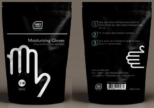
In describing her project, Lauren said,
My thoughts for this design were to keep the layout as simple as possible. Less text to get the point across quick from the design. The viewer should know what the package is immediately, so the use of a bold white outline around a black gloves hints and also tells the consumer the product is a black glove. Secondary to that, telling that consumer that this is a moisturizing glove. Having this simple layout also creates a more elegant look making the brand have a higher quality look.
Color choices were picked due to constant colors used in salons and other personal care stores. Tan is the most known color. Having a bold black package allows that consumer to see the product from far and also pulls in the consumer in from a distance. This also holds that elegant look stores look to keep.
Adding subtle color changes and small details allows the consumer to pick between the three and five finger product. Referred genders are offered for sizing purposes but design gender distinctions are not overpowering so if a consumer prefers the other option they will not feel uncomfortable choosing that other package.
My process is always to do simplicity, to keep the product simple that the consumer gets all the important information only on the product and remove the unnecessary.
Other work of Lauren’s can be seen here: https://www.behance.net/laurencarbone22.